Wednesday, October 13, 2010

Self Portrait Part 2


This is my second self-portrait done on Illustrator. It is me and my dog captured in "Fish Eye Lens" mode. I personally don't think that pictures come out very flattering when they are captured with Fish Eye Lens, so I decided to step outside of my comfort zone and distort it a bit. In the picture is my dog Zacky, whom I absolutely love. I've heard people say that sometimes dogs look like their owners and I thought it was funny how in this picture we kind of look alike with the eye color and the way our faces are positioned.

Artist Book


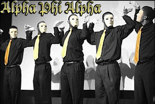
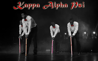
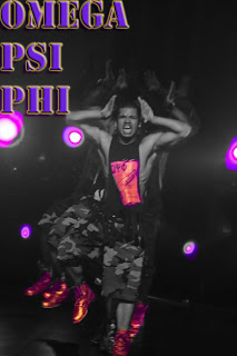
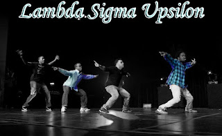
For my Artist Book I decided to do something that represents who I am and what I love. I am a Sister of Chi Upsilon Sigma National Latin Sorority, Inc., meaning that I am very involved in Greek life. I also love photography and love capturing life through the lens of a camera. Above are four pictures of four different Fraternities. What the people in my pictures are doing is something called "stepping" or "strolling". Stepping is a tradition that dates back to the first historically Black Greek organizations. No specific date can be targeted for this tradition however, because some black Greek organizations feel that this tradition can be traced back to Africa and the customary tribal dances. The first three pictures come from the chronological order in which each fraternity was founded; and they are "black" fraternities. The last picture is a Latino Fraternity that also steps and strolls. Strolling functions by having members of a particular Greek organization line up one after another. They begin to move forward through the club in the same dance motions, or many times alternating dance moves. The practice of strolling is an organized event, as members in a line know every step of the choreographed stroll showing unity among the organization's members. I decided that I would do my pictures in black and white, leaving in color the representational colors of each particular organization to add a deeper meaning to what they each stand for and their individuality (all done in Photoshop). The names of the organizations were added on both Photoshop and Illustrator.

I have realized that not many people outside of these Organizations know much about stepping or strolling. To me it is an art form done through body movements that shows unity amongst the members. I hope to have shed light on a subject that is so important for me. I am also very happy that this type of art form has been passed down from black organizations to Latin/Latino organizations as well, unifying us as a minority group.

Tuesday, October 12, 2010

Artist Presentation
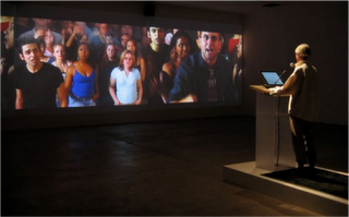


Rafel Lozano-Hemmer

For this presentation we chose to work with Rafael Lozano-Hemmer and Don Ritter. Both artists were chosen because they both use digital media and interactive technology. They incorporate the audience into their artworks by having them manipulate the effects. Therefore, the theme of the presentation is human interaction and behavior using digital interactive technology.

The educational value of this exhibit is very beneficial. Both artists use technology that is advancing by the minute and has played an important role in the art world, because of some controversial issues. The artists that we chose to display just go to show that technology is a very powerful medium and it helps to keep the art world alive as technology progresses.

The workload was divided fifty/fifty and split the work evenly. The easiest way to divide the work was to choose two artists that would work well with each other then do independent research, later meet up and combine it and do extra necessary research.

Wednesday, April 28, 2010

Self-Portrait on Photoshop
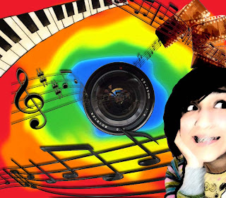


I decided that I HAD to do my self portrait about the two things I love the most. Music
and photography. The background is very "me" too because I have been described as
all the colors of the rainbow. I'm really bubbly and whatnot. The picture that I used of myself
was taken some time in high school and I just always thought it was a funny picture and
I finally had a chance to use it in my art. I placed the lens directly in the middle on purpose,
as if to show that there's a picture being taken.

Sunday, April 25, 2010

Museum Visits

I live about ten minutes away from the city, so I decided that I would visit museums in my own area. I first went to the International Center of Photography where they had the "Twilight Visions: Surrealism, Photography, and Paris" exhibition. I really loved this because I am very interested in photography. What I enjoyed learning was that this photography played a dramatic new role in both avant-garde practice and mass culture of Paris and just the different ways that they captured scenes around Paris. They also had the Miroslav Tichy exhibition. He was an artist who made his own cameras out of random everyday products and took candid pictures of women at pools. I thought it was just incredible how he created such a powerful tool out of things that we might consider to be garbage and was able to capture such good quality photographs for the time period. The next museum I visited was "The Kitchen". I can honestly say that I have no idea what the exhibition was about. There were a bunch of television sets everywhere just playing white noise. I went in and walked right back out. I tried going to the MOMA to see the Tim Burton exhibition but unfortunately it was sold out for the day. I was very very sad. But other than that, my trip went very well and I look forward to visiting the International Center of Photography when they have a new exhibition.


Wednesday, March 31, 2010

Logo Assignment Tutorial


The "Potter" needs to be added, but you get the point. I like Harry Potter. :)

Midterm Composition #2


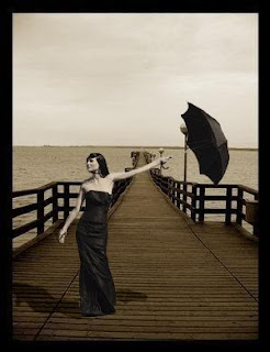
This is probably my favorite piece of work so far. The background is really weird, which is why I was so drawn to it. The original color is the color of the background, so I had to make sure that the model was practically the same color. The tools used were the magnetic lasso tool, eraser, smudge, blur and burn tool. Curves were also altered and so were the Levels. Positioning her was interesting because there were many areas that I could have placed her, but the one that she is in now was the one where she looked most natural.